Better Site Conversion Hiding in Plain Sight - UI Animation
First impressions matter. Thoughtful motion reduces friction, builds trust, and boosts conversions. Used right, it guides users and enhances clarity from the first click.


Humans form rapid first impressions. We’re hardwired for it, and it happens with most everything we encounter that’s new to us, websites included.
When we hit a site for the first time, our brains rapidly judge context, trust, and value. And those first impressions are sticky — they tend to endure, even when we later get conflicting information.
Great designers understand this. They shape those early moments with intentional, intuitive design. Their goal? To craft frictionless, high-performing digital experiences that convert.
Avoiding Friction
Well-designed websites guide visitors toward key goals — finding information, signing up, making a purchase.
Designers create visual systems that package content, interface elements, and cues for interaction. Each of these components — some large, some small — can influence whether the user stays on track.
When any one piece of that system feels off, unclear, or inconsistent, the whole experience can suffer. These micro-frictions may seem small, but they add up — and they can cost you conversions.
Overlooked details degrade the intuitive quality of a design; this has been proven to hinder marketing performance. “Friction” is real, yet difficult to perceive.
These common issues quietly kill conversion:
Confusion & Ambiguity – When users aren’t sure what to do next, they stall — or leave.
Increased Cognitive Load – Small inconsistencies force people to think harder than they should. It’s frustrating, and it leads to hesitation.
Poor Accessibility – Low-contrast text, clunky navigation, or broken responsive layouts alienate users and hurt usability.
These issues are hard to spot if you’re not looking — but easy to measure. High bounce rates and conversion drop-offs often trace back to overlooked design details.
Directing Intent Using Motion
Cantilever uses a framework called DEMO to evaluate and improve websites. DEMO stands for Discovery, Ease of Use, Message, and Offers, four pillars that are essential to creating websites that attract and convert visitors effectively.
Ease of Use is how we think about directing user intent, and one of its most underrated enhancements is motion.
UI animation touches nearly every aspect of a site’s design. Done well, it’s a subtle guide that draws attention to key actions, reducing confusion, and helps users feel in control..
Motion is a tool. It’s crucial on hardworking web pages that contain essential information or calls to action. And it’s really easy to overuse. Motion is simple to integrate, so everyone does.
Motion Done Well
A really effective web design weaves all the key pieces of a user experience into a seamless interface.
And the trick with animation – the craft of designing intentional “ease of use” – is to identify when it may benefit your site visitors and then how to execute.
Here are a few ways motion can improve performance:
Signal Brand Values
Consistent design creates coherence, and this builds trust. Intentional animation signals quality and can express a brand’s identity.
This subtle yet influential source of differentiation, connection and credibility helps visitors feel they’re in a professional, positive environment, right from the start.

Increased engagement
Smart animation holds attention by guiding the user through the interface — showing what’s clickable, what matters, and what’s next.
Users who get lost or confused grow frustrated really quickly, and are unlikely to convert or even return. Animation can quietly teach and orient, reducing frustration and bounce rate.

Reducing cognitive load
“Functional” animation exposes the logic of an interface in a natural way, teaching visitors how a webpage behaves with visible and intuitive system response.
This may sound complicated, but humans are great at pattern detection; simple patterns can be powerful teachers. These moments teach users how to interact. Less confusion, more confidence, better outcomes.
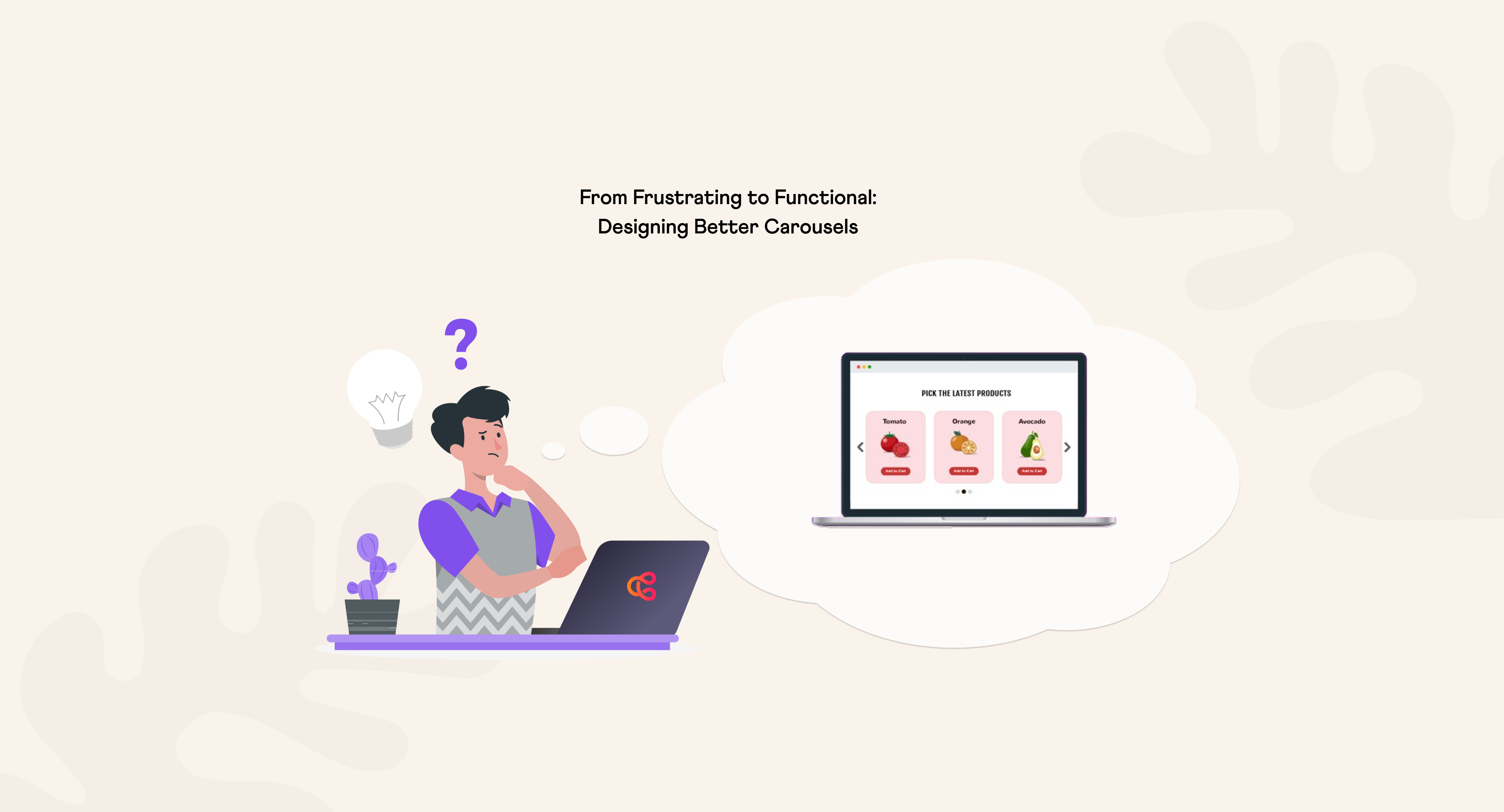
Something as basic as a smoothly expanding dropdown menu will help visitors understand its connection to the button they clicked, that it can be collapsed again, and that the button provides access to other information.
This landmark is a tether of sorts that frees a visitor to explore page content, safe with awareness of alternative pathways should they not find what they seek.

Conclusion
Visitors arrive at your website with expectations that have been shaped by their goals and past experience. They’re making snap judgments from the moment they land.
Well-crafted animation helps make the most from these moments by reducing friction, guiding attention, and bringing clarity.
In a world where users decide in milliseconds whether to stay or bounce, these subtle cues can make all the difference.
Make your website work for you
Get top dev and accessibility tips delivered directly to your inbox for a more impactful online presence.


Related blog posts


We create & maintain websites that get results. If your website is important for your business, you need a dedicated team of experts taking care of it: Cantilever.
learn more about us
