Website Carousel Do’s, Don’ts, Alternatives, and Best Practices (with examples)

If you’re thinking about adding a carousel to your website, the first question to ask is should I?
The reason for caution is that carousels get a bad rap, and for good reasons. Here are a few:
Banner Blindness: Carousels add motion to a webpage, and unless done well this can create visual noise leading to “banner blindness” – website visitors skip over them altogether.
Poor Engagement: Data generally shows that carousels have low engagement, begging the question about whether the space they occupy can be better utilized.
Core Web Vitals: Carousels can slow page load times (hurting SEO and UX) due to JS and CSS dependencies, and the need to load many images.
Mobile UX: Carousels often have poor mobile UX, which frustrates mobile visitors and damages the value of this important source of customers.
Web Accessibility: Serious accessibility issues are common, creating problems for as many as one in four web users in the US.
And yet, carousels are popular
Despite these issues, carousels are everywhere, and here’s why:
Imitation: Many big brands use carousels. Smaller companies may follow this lead, believing that “what’s good for them is good for us”. The error in judgement here relates to the rigor with which larger brands approach website optimization.
Business Preference: Showcasing multiple messages at once is easier than prioritizing key content. A carousel offers an workaround to dealing with this common marketing challenge.
Visual Appeal: Some designers and site owners favor the dynamic and modern feel of a carousel over the reality of low engagement rates.
Easy Integrations: Related to the previous point, WordPress, Shopify, Squarespace and other plug-and-play platforms provide carousels add-ons that are simple to implement, even for non-developers. Platform users adapt what’s available.
Lack of Measurement: A business that does not measure what a carousel contributes to a its bottomline is blind to its true value.
Untested Assumptions: Related to the previous point, research shows that most users see only the first slide of a carousel, yet many companies assume all slides are viewed equally.
Carousels – a bad idea unless user benefit is crystal clear
Every design pattern or component on a website should be integrated with intentionality, a practice that helps to mitigate ‘build it and they will come’ decision-making.
Adding a new feature from this perspective–meaning actual performance will be benchmarked against expectations for how should perform–enables website optimization and stronger marketing outcomes,
So when considering a carousel, decide who it will serve best and how before making a decision to build it out.
A carousel that has a logical role in aiding website visitors in finding information or completing a transaction is worth considering (ust make sure that its contribution is measurable.
But visitors will ignore a carousel if it lacks a clear importance to tasks like these, leaving you with a waste of important website real estate and potentially sub-optimal website performance.
Carousel Alternatives
When unsure about a carousel's value, several proven alternatives are available that create a more inspiring way to highlight products, features or offerings in a compelling and measurable way.
Hero banner
A hero banner contains a single, prominent image, animation or video paired with a strong message and clear call-to-action (CTA), or a main message with very select sub-messages and CTAs.
Hero banners are effective at funneling attention to a single action, which works well for a major promotion, flagship product, or brand imperative, for example,
Since a hero banner’s focus is commonly a single call-to-action, it is a straightforward, testable design pattern. It also may provide stronger technical performance relative to carousels (by loading faster), which boosts UX and on-page SEO. Finally, building accessibility into hero banner patterns is much less complicated than doing so with a carousel.
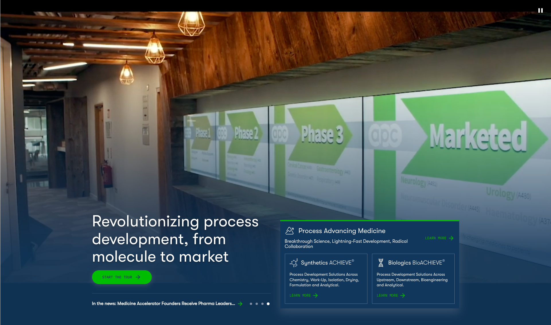
A hero banner example that demonstrates the design pattern’s benefits can be found on the APC website homepage. APC is a Cantilever client, and a key objective we took on when redesigning their site was to provide clear, concise communication about their offerings (which are technical in nature).
The hero banner’s combination of a focused visual design and calls-to-action supports this need well. The hero area rapidly engages visitors visually and with clear CTAs that lead site visitors to important areas of discovery, where APC’s laboratory environment is emulated through visuals, interaction and motion.
Grid-based hero section
A grid-based hero section breaks content into visual blocks with a combination of images, text, and calls-to-action that convey product, service, or promotional priorities.
This design pattern is useful for presenting multiple yet prioritized options—such as product categories, top-selling items, or key services—without forcing users to scroll or interact with a carousel.
Grid-based hero areas allow website visitors to rapidly scan and choose what interests them, providing efficient, intuitive navigation (both hallmarks of a strong user experience).
Grid layouts also adapt well to different screen sizes, ensuring an effective experience across both desktop and mobile viewports.
Cantilever utilized a grid-based approach when redesigning CoverSports.com, by combining a strong, call-to-action orientated hero section on its homepage and grid-based product category pathways.
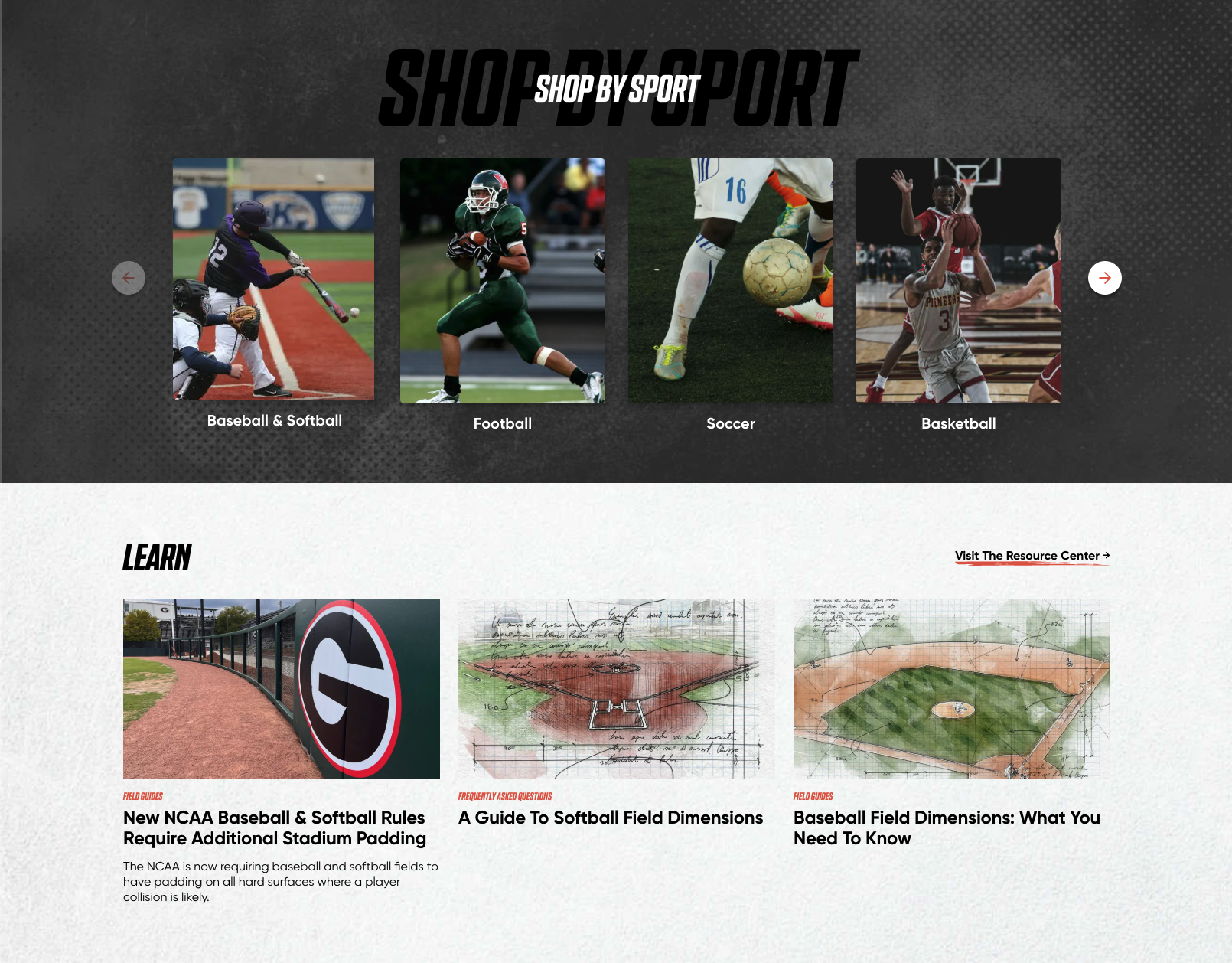
blocks, each with an image, title, and CTA for quick access.
Tabbed Interface
A tabbed interface design pattern is another good alternative to carousels. Similar to a carousel, this pattern enables access to a lot of information within a compact area of a webpage’s interface, but with key differences.
While a carousel is most commonly a sequential browsing experience (users moving linearly through single slides at a time, or grouped batches of slides), tabbed interfaces provide a non-linear content experience.
Navigation occurs by clicking on labels rather than scroll arrows. Labels communicate meaning and context about content, allowing website visitors to easily navigate content according to their own needs. Tabs keep the design compact, reducing clutter while giving users control over their browsing experience.
This design pattern is effective for presenting service or feature descriptions, featured collections, or customer resources– and can be especially effective for addressing different customer segments.
A great application of a tabbed interface can be found on Asana’s homepage. Asana, a project management platform (used by Cantilever), employs a tabbed interface on its homepage to communicate benefits unique to an organization’s departments.
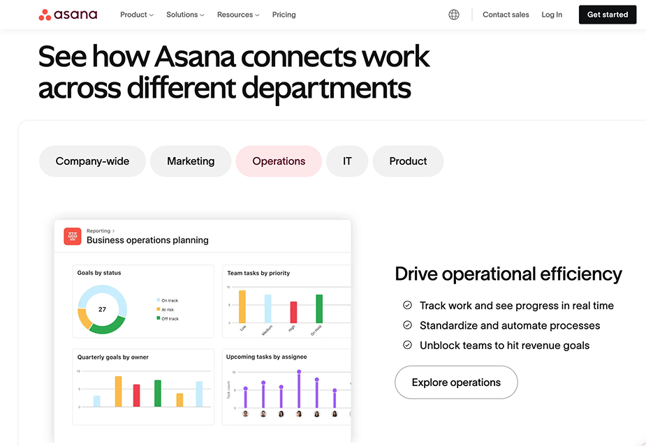
like “Marketing” and “IT,” each revealing tailored content and CTAs.
Carousel Integration Best Practices
DO clearly indicate scrolling direction
Users inherently assume a left-to-right scroll direction for carousels, the same direction in which we read (with exceptions such as Semitic or Arabic-based scripts).
Reversing to a right-to-left scroll direction, or adapting a vertical scroll, creates cognitive friction and leads to confusion and frustration.
The best approach when implementing a carousel is to design for a standard scroll direction, with clear, visual indication of the initial (i.e. left to right) scroll direction. That can be accomplished by hiding the reverse scroll control in the carousel’s initial state..
DO use progress indicators (but avoid dots)
Effective user experience design entices users into exploration and action. Progress dots, which are navigational elements, don’t communicate meaning aside from some expectation for progression thorugh content.
Mobile usability of progress dots is problematic because tap areas must be large enough for touch navigation, and the UI may not have room for this. Enabling swipe gestures on mobile is a good work-around for this issue, as well as a UX best practice.
Another work-around for carousel navigation is to replace dot navigation with labels or thumbnail images, an approach we took at the product page level on CoverSports.com.
Rather than packing related product images into a carousel navigable by arrows, site visitors use thumbnail images to view product examples. Thumbnail navigation provides site visitors an easy way to scan available content that is navigable in a non-linear progression. It’s a simple yet effective method for giving website visitors control over their content experience.

gallery under the main image, letting users browse items without arrows.
DO indicate content position
Showing users where they are within a digital space (and what actions they should take next) is an important element of effective design.
Just as clear signage in a physical space prevents disorientation, digital wayfinding elements—progress indicators, breadcrumbs, and other navigation cues—guide users through an interface intuitively. Without this, visitors have to guess, creating confusion and frustration.
This also applies to carousels, which should always clearly indicate a user’s progression through available content. A well-designed indicator enhances navigation, reduces uncertainty, and keeps users engaged.
A great example of this can be found on the Metropolitan Museum of Art’s website, which uses date labels as visual progress indicators.

DO always use previous / next buttons
Always include previous and next buttons on a carousel to ensure clear, user-friendly navigation. This allows site visitors to move through content at their own pace (and is a must-have replacement to auto-rotation).
Additionally, previous/next buttons improve accessibility (when they include aria labels), making it easier for users with motor impairments or those using assistive technologies to browse content.
DON’T use auto-advance
Auto-advancing carousels hurt usability more than they help by taking control away from site visitors, making it frustrating to read or engage with content before it disappears. This is especially problematic for people with slower reading speeds, cognitive impairments, or accessibility needs.
Auto-advance can also cause banner blindness, where users ignore the carousel entirely because it feels like an ad. Instead, giving users full control—with clear next/previous buttons and manual navigation—creates a better, more accessible experience.
If an auto-advancing behavior is somehow crucial, make sure to include a “Pause” button so users have an option to pause auto-rotation.
DON’T ignore accessibility
An accessible carousel:
- Uses semantic markup
- Allows users to stop all movement
- Stops rotating when keyboard focus enters the carousel
- Does not restart unless the user explicitly requests it to do so
- Stops rotating whenever a mouse hovers over the it
- Provides visible controls that are operable by keyboard, mouse, and touch
- Provides a logical focus order for keyboard navigation.
Carousel Use Cases
Product Category Exploration
A Monster Menu is a large navigation menu designed for access to a large amount of information, such as a large product catalog or multiple business sector solutions. When well-designed, it serves as a logically structured navigation system that enhances usability for businesses with diverse offerings.
However, these large, complex menus can overwhelm users by presenting too much information, and may cause issues on mobile due to small tap areas and other interaction problems. While large menus can be highly effective in certain contexts, poor execution can lead to usability issues.
In certain use cases, an effective alternative to a large menu is a carousel, particularly when used to showcase key product categories in a visually engaging way.
For example, both Ikea and BestBuy use carousels for product exploration as part of their primary site navigation. BestBuy maintains this feature down to mobile viewports, while Ikea shows it only for desktop.
As with any carousel, clearly-defined user controls are crucial. Both Ikea and BestBuy include clear directional arrows, and Ikea uses a horizontal scroll bar effectively as a progression indicator.

navigation arrows, and a scroll bar to guide users through product categories.
Feature / Benefit Exploration
A well-designed carousel can be a powerful tool for explaining key features efficiently, especially in space-limited areas of a website. Probably the most common use case for feature exploration is in eCommerce, where carousels showcase multiple product images, color options, or key selling points.
Carousels are also used frequently by SaaS companies to break down complex features and benefits into digestible chunks of content.
Testimonials & Reviews
A final use carousel use case pertains to testimonials and reviews…when well-timed and well-structured, they can create a compelling narrative in a sequential, digestible manner.
However, if this content is key to a purchase or conversion path, bear in mind that generally, carousels get low engagement and, because they force users to click through multiple slides, they may limit visibility of important information.

Wrap Up
Hopefully, this post has helped you navigate key considerations regarding carousel usage. While they can be visually engaging, carousels also introduce usability challenges.
If you opt for a carousel, ensure that it aligns with users needs, loads quickly, and remains accessible to all.
At Cantilever, we believe in Digital Hospitality—websites should welcome visitors, not make them work harder. If a carousel supports that mission, fantastic. But if it risks creating confusion or friction, it may be time to explore a more user-friendly alternative.
Ultimately, the best website experiences are those that guide users effortlessly toward what they need. Thoughtful design choices—including how (or if) you use carousels—can make all the difference.
Make your website work for you
Get top dev and accessibility tips delivered directly to your inbox for a more impactful online presence.


